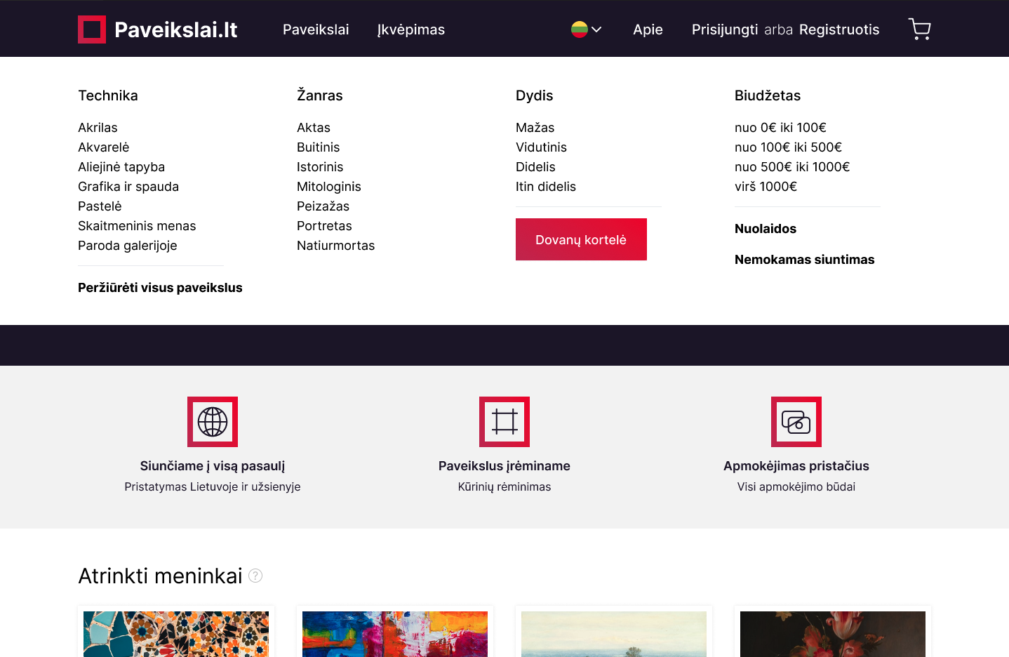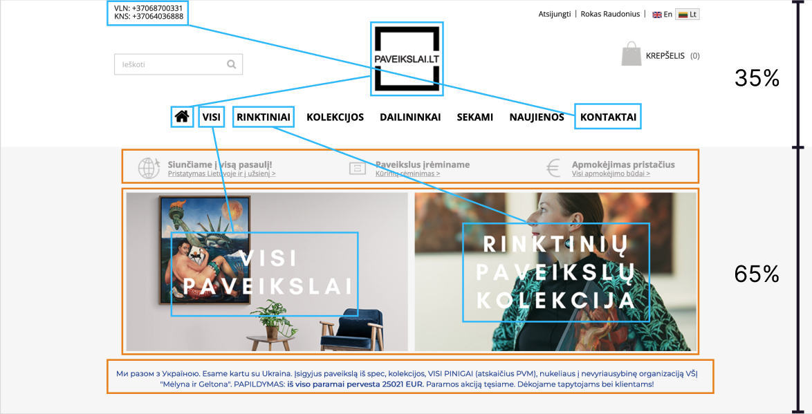



I reduced menu bar height by moving majority of content to the navigation dropdown menu.
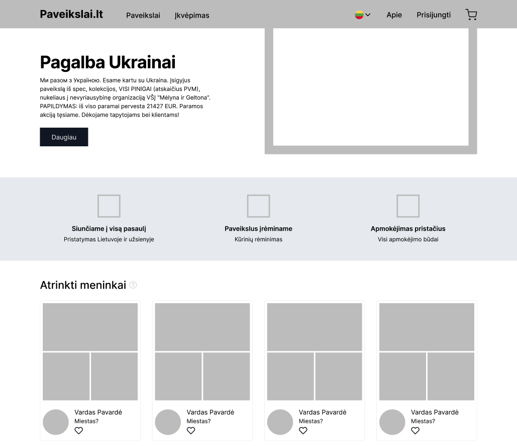
I opted out of adding a content slider, because they slow down site performace, increase user frustration (user does not feel in control when slider changes automatically) and are difficult to make it properly responsive for mobile.
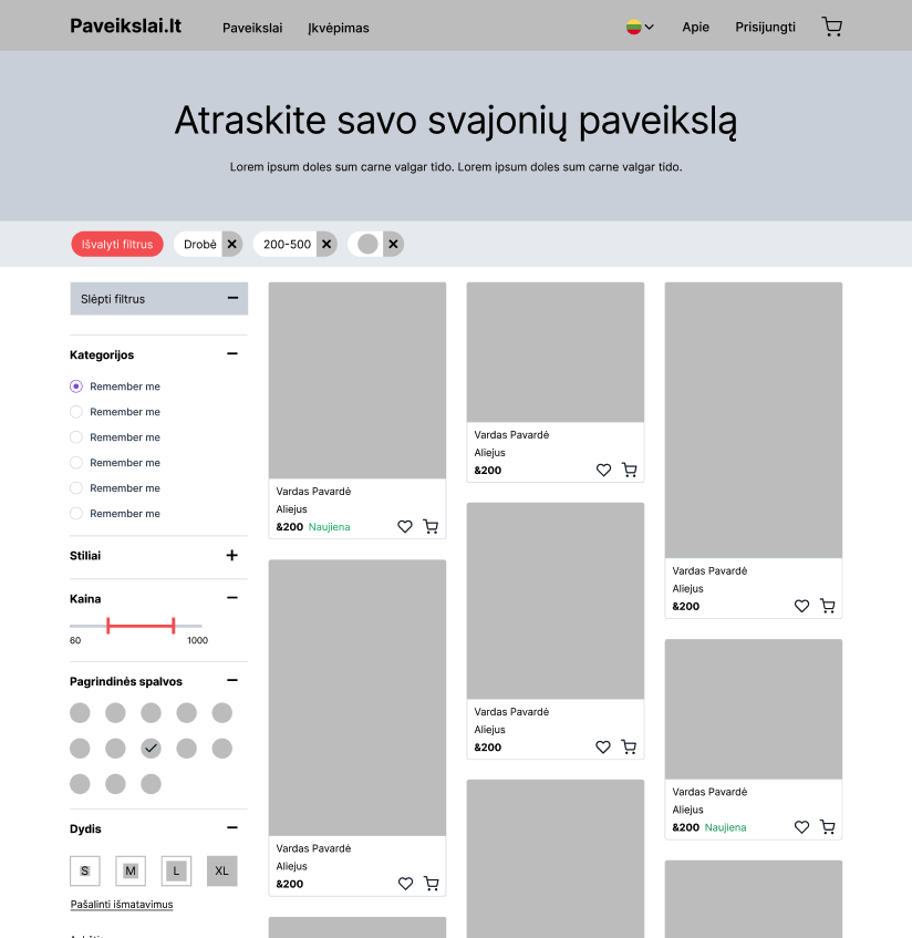
The left-hand sidebar is more scalable in terms of real estate, it can nest a greater number of values inside expandable sections that can scale vertically.
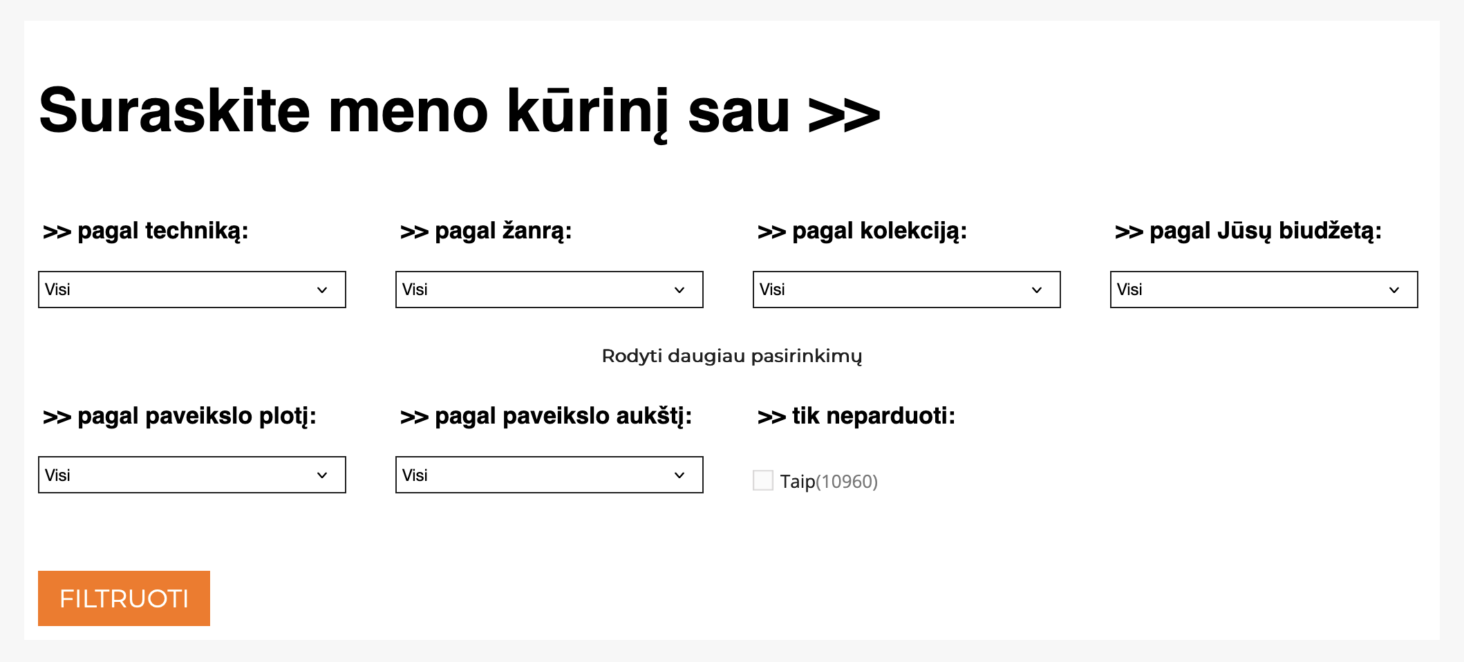
Also, this pattern affords that the filters affect the page as a whole.
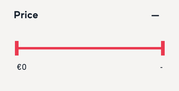
I Included additive filter bar, because filtering has to exclude anything that doesn’t match the combined filters.
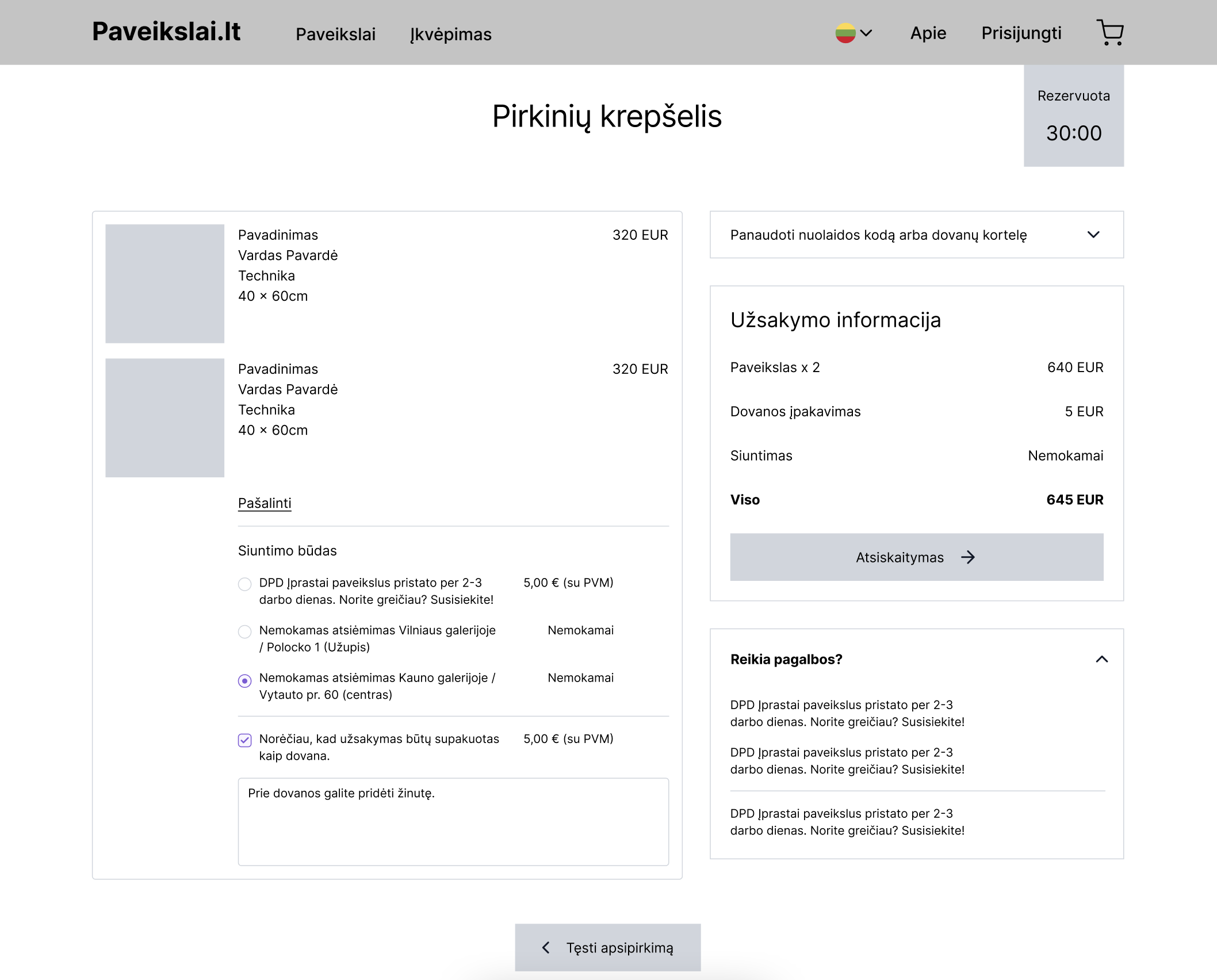
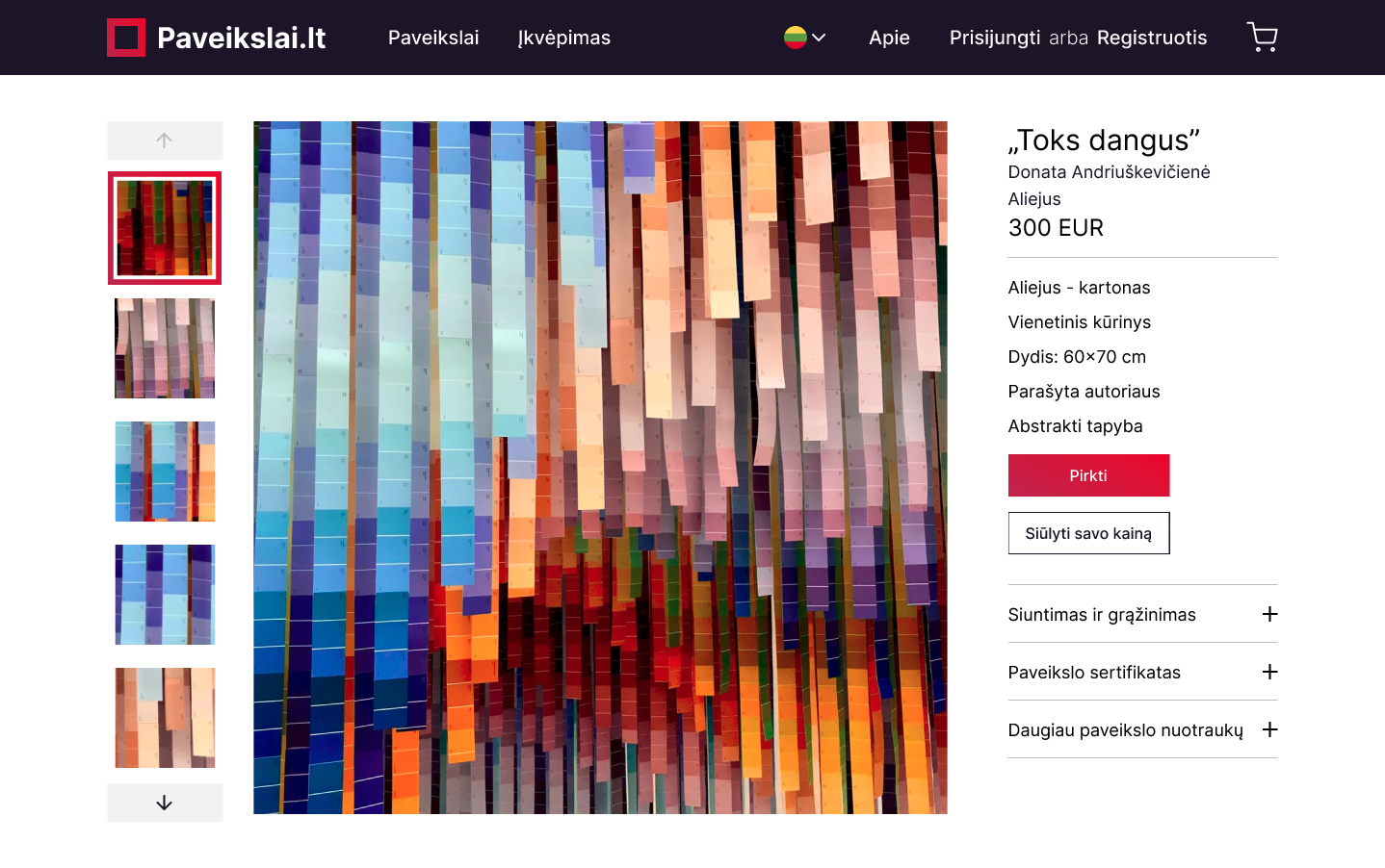
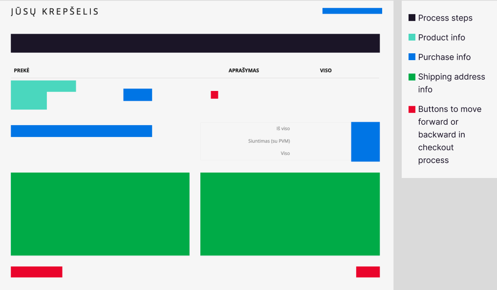
Information grouped together
Customer help dropdown
Clear CTA to forward purchasing journey
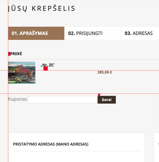
"Guest Checkout" the Most Prominent Option.
Use “Delivery Date” Instead of “Delivery Speed”.
Present "Store Pickup" Within the Shipping Selector Interface
Allow Users to Edit Data Directly at the Review Step
Mark Both Required and Optional Fields Explicitly
"Back" Button Use for Navigating to Any Previous Checkout View