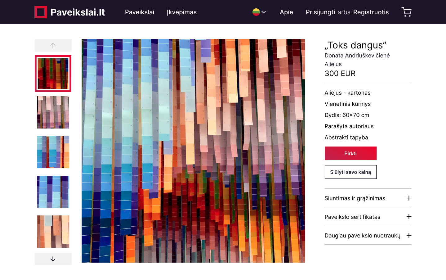
Paveikslai.lt page redesign  

Client: Me
Type of work: UX/UI design
Context
This project began when I wanted to buy some artwork to spice up my flat's empty walls. I found a lot of great art in this page, but the whole shopping experience on Paveikslai.lt website was less than colorful.


The goal of this particular project was to identify usability issues with the current website, determine the critical features to create a better art buying experience and design them.
Challenge
How might we design a better art shopping experience?
My tasks
Established a design kit. This has helped to maintain consistency in the look and feel across different parts of the platform.  

Established a design system.

UX evaluation

Home page

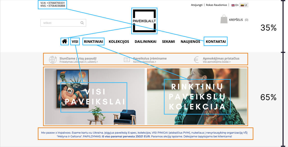
  1. Centered logo isn't UX friendly (source)
  2. Contact information doubles
  3. Links to pages double
  4. Home page doubles
  5. Header takes too much valuable space
  6. Multiple font styles
  7. Page sections indistinguishable

Search functionality

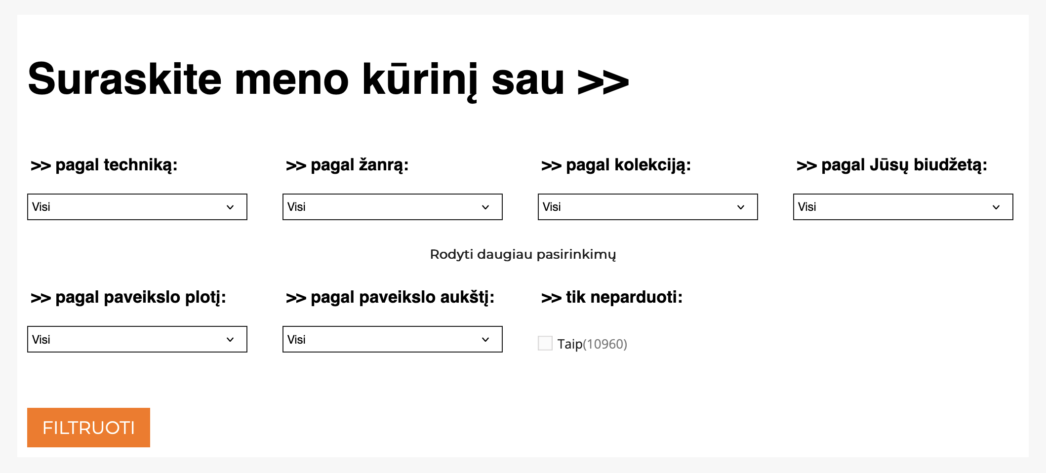
  1. Search functionality does not allow to filter by color.
  2. Filter by size is not intuitive
  3. Default showing of sold items
  4. Budget categories are fixed, not on a scale
  5. Redundant bullet points
  6. Small (inaccessible) text size

Artwork display

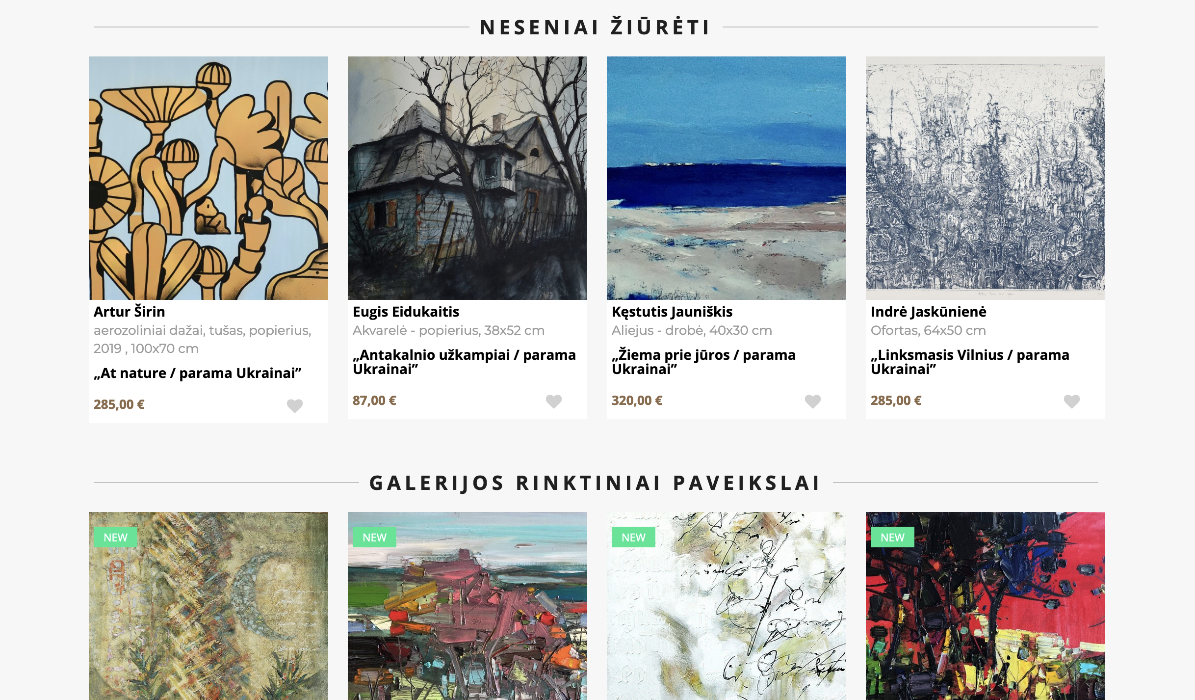
  1. Black frames add visual noise
  2. Cramped tile spacing doesn't give space to look at each artwork separately
  3. "Įsigyti šį kūrinį" can be replaced by a symbol to reduce repetitive text on each card

Checkout

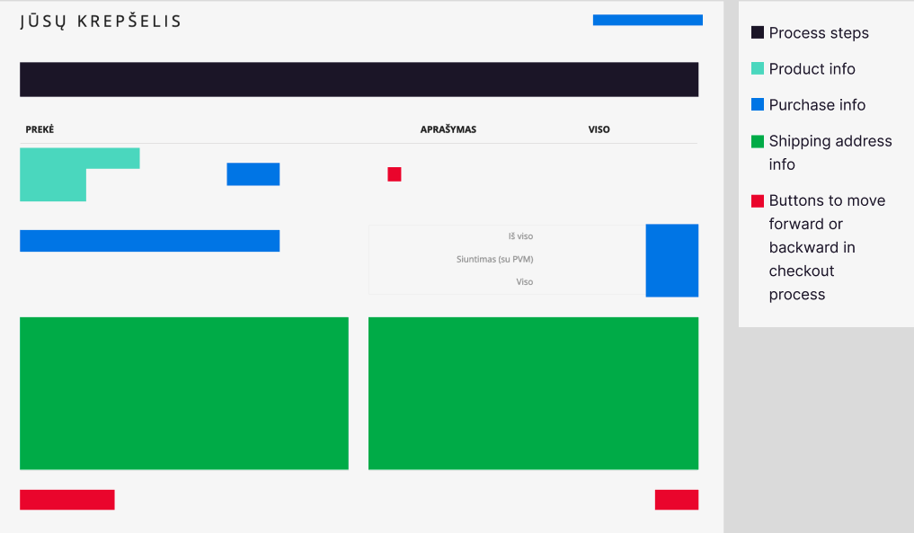
  1. There are multiple alignment problems not only in checkout, but almost all pages
  2. Information hierarchy is quite confusing and chaotic

Inspiration

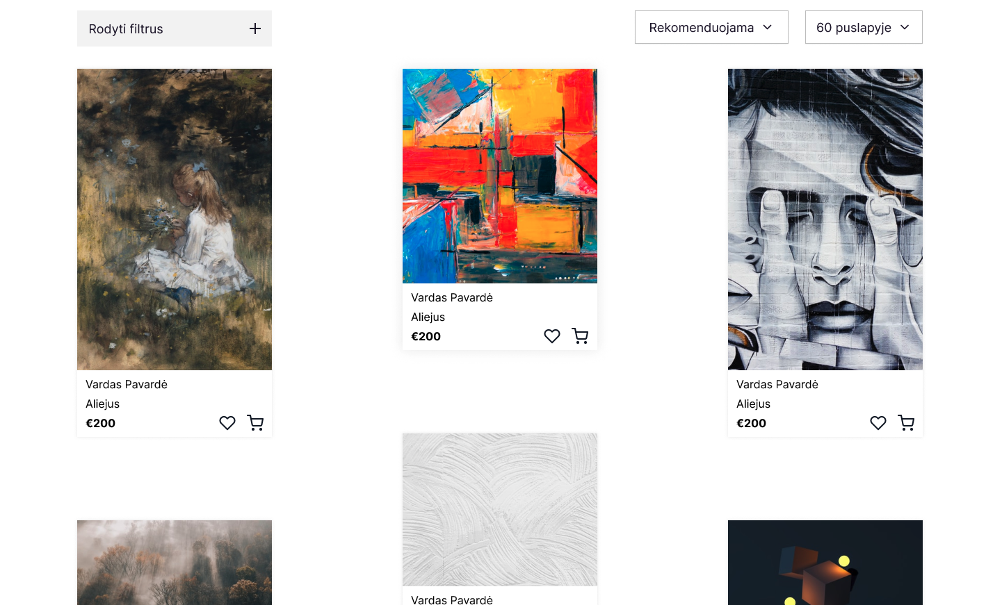
Although majority of online art platforms use closely packed card layout to fit more artwork in one screen, it also makes it crowded.

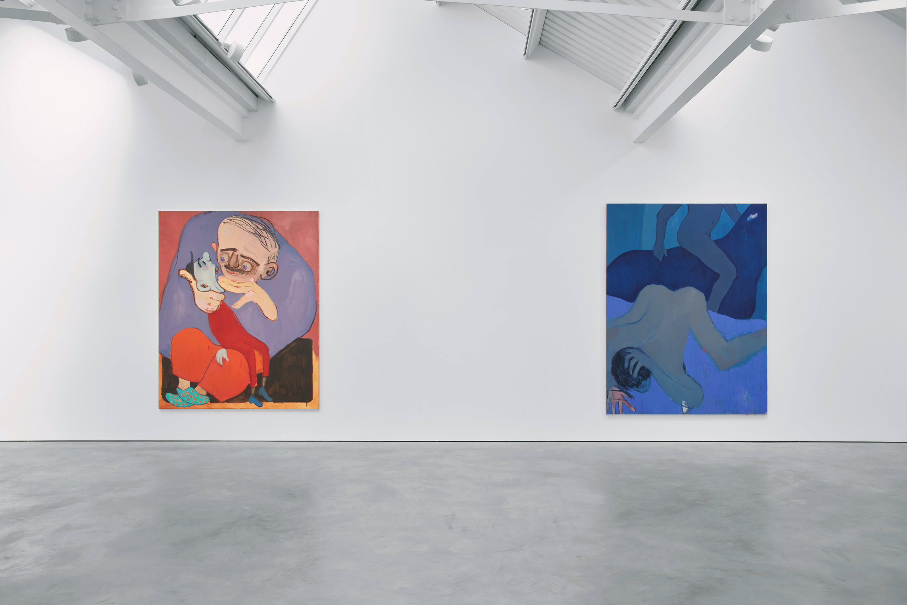
In artwork galleries paintings have plenty of space around them. It helps viewers to focus and appreciate the art piece freely.

I decided to add more space between cards by default and an ability to view more concentrated layout as an option.
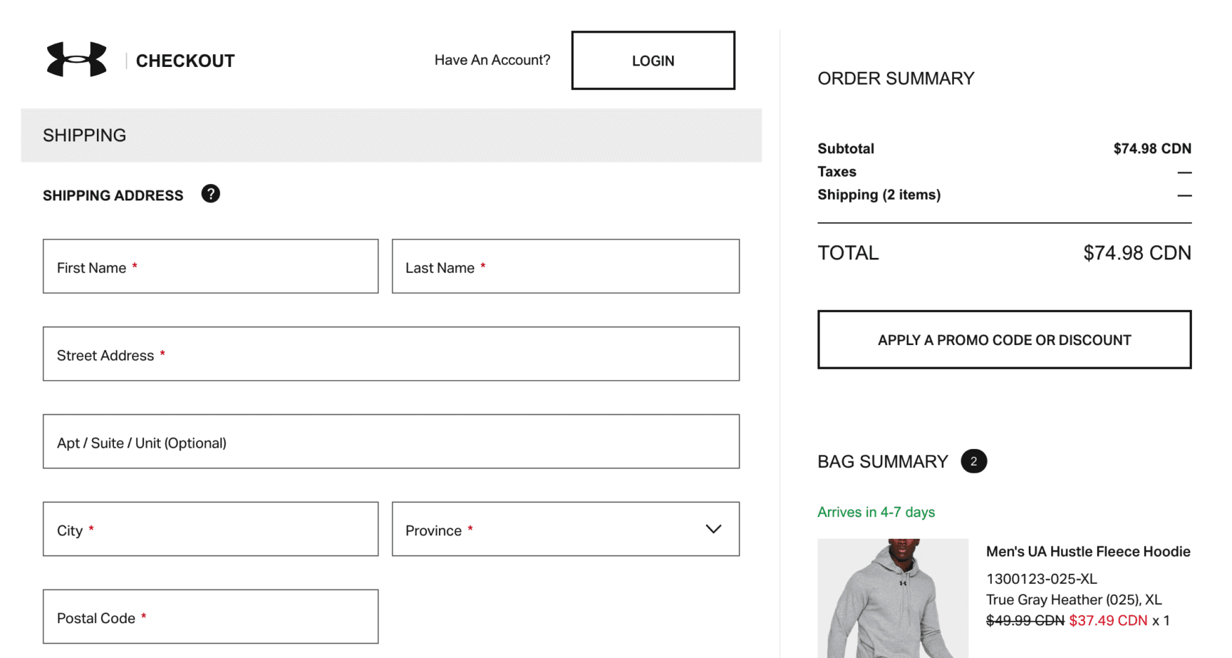
From Amazon to Zalando, major companies have well optimised check-out flows. There are alot of interesting ways to guide customer from the shopping cart to payment, however sometimes it's better to follow tried and tested basics.
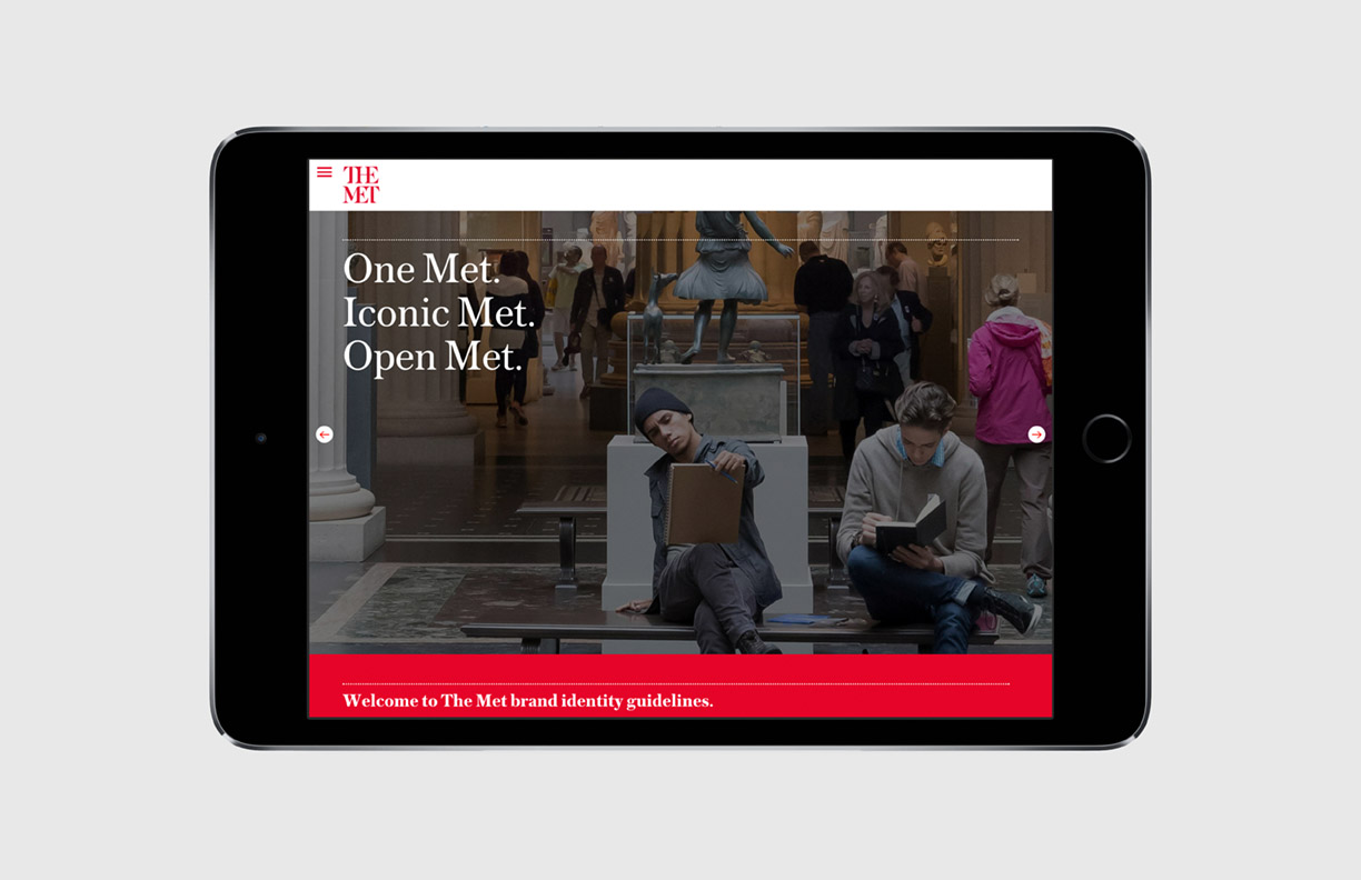
I chose design style that bridge classical and simple MET brand style and modern bold feel of MoMA.

Wireframing

I had a quite complete website flow in my head, so I skipped sketching and went directly to wireframing part.
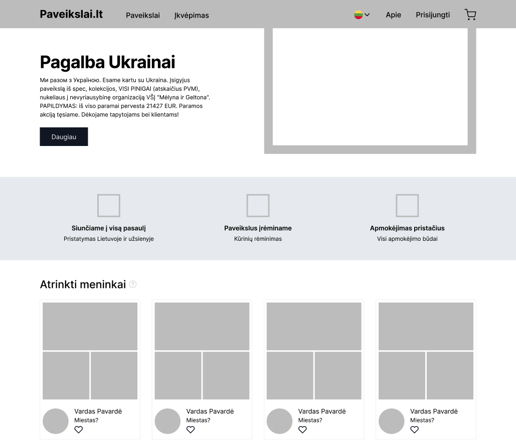
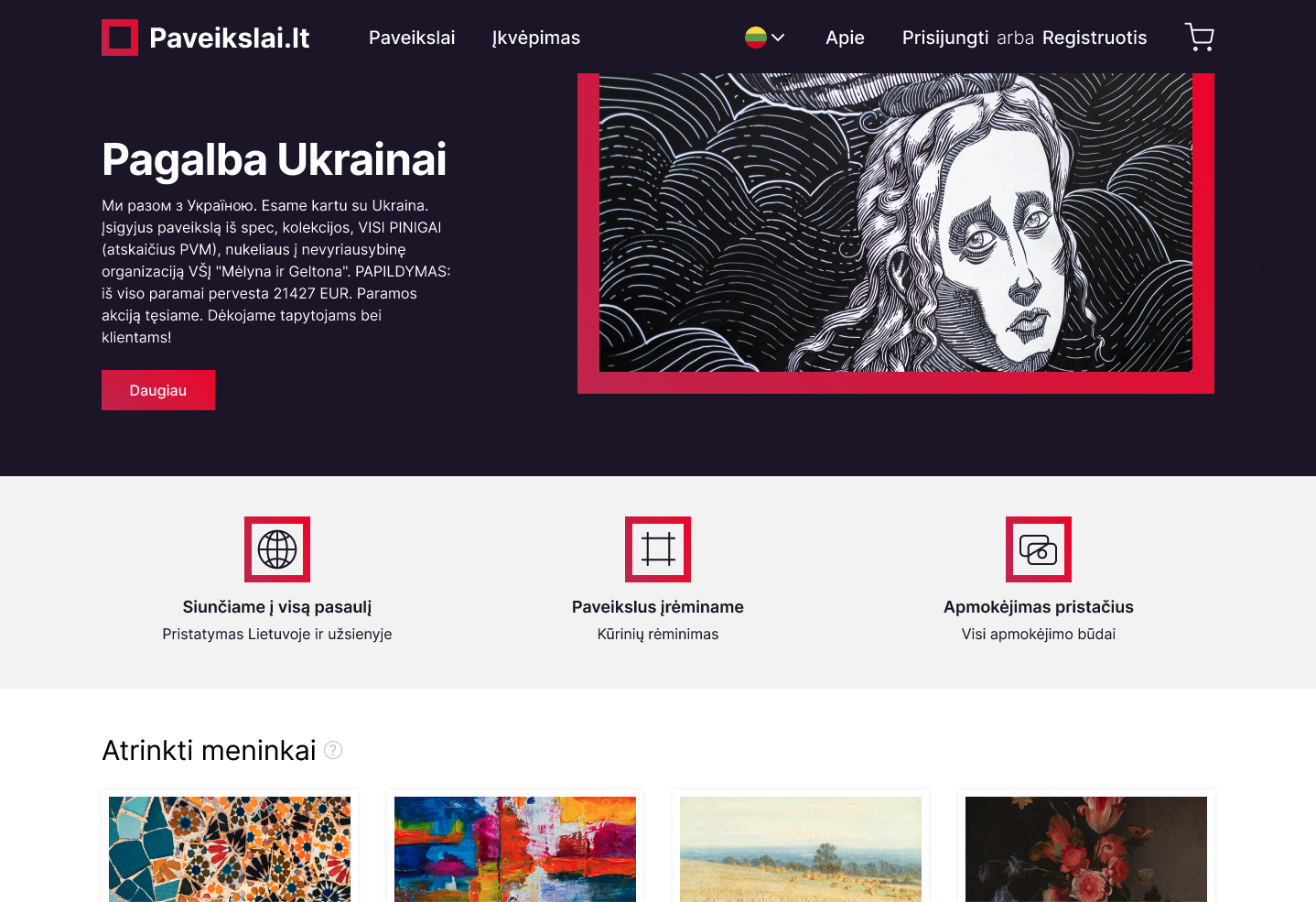
I reduced menu bar height by moving majority of content to the navigation dropdown menu.

I opted out of adding a content slider, because they slow down site performace, increase user frustration (user does not feel in control when slider changes automatically) and are difficult to make it properly responsive for mobile.
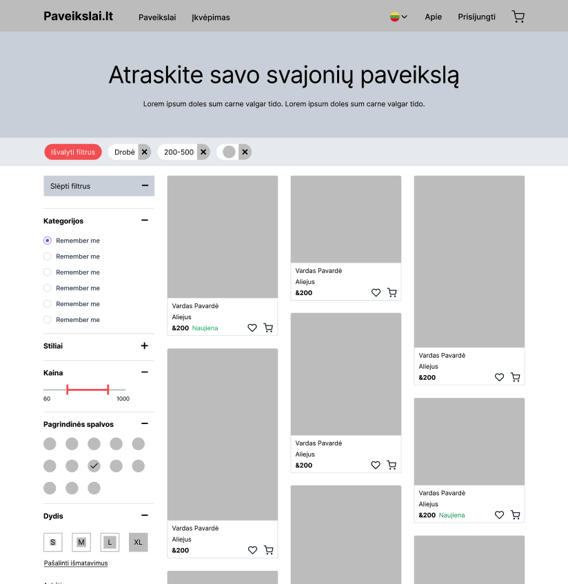
The left-hand sidebar is more scalable in terms of real estate, it can nest a greater number of values inside expandable sections that can scale vertically.

Also, this pattern affords that the filters affect the page as a whole.

I Included additive lozenges bar, because filtering has to exclude anything that doesn’t match the combined filters.
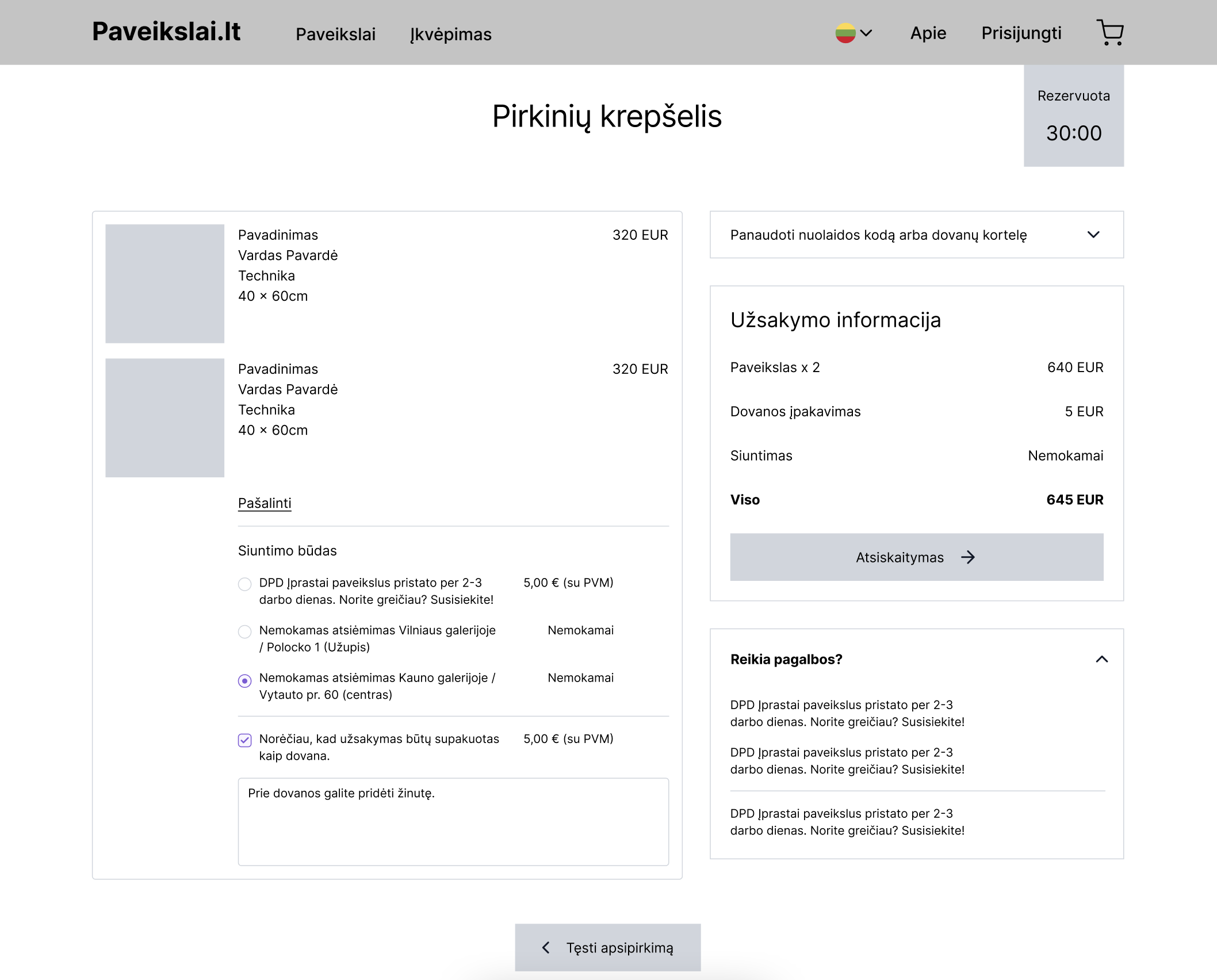
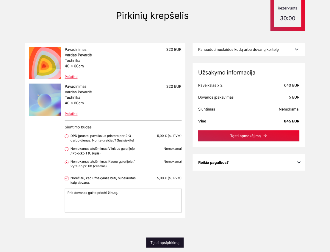
I didn't add anything unique to the checkout pages - the best practices are already well established.

UI design process

As a designer, I aimed to create a modern, minimalist website for an artwork e-shop that would showcase the beauty of the artwork.

To achieve this, I incorporated plenty of white space in the design to create a clean and uncluttered look that would highlight the colors and details of each piece.

By using a simple color palette and minimalistic design elements, I hoped to create a timeless and elegant look that would appeal to a wide range of customers.
Additionally, I included an extensive filtering sidebar to help customers easily find the pieces they are looking for by allowing them to filter by various criteria such as size, price range, style, and color. This feature was added to improve the user experience and help customers quickly find the artwork that best fits their preferences.

Overall, my design decisions were made with the goal of creating a visually stunning and user-friendly website that would showcase the beauty of the artwork while providing customers with a seamless shopping experience.
I used desaturated color palette to bring out colors that are in the artworks. I also used saturated red color for accents and CTA's.
Giving more space to each card reduces visual load and allows to appreciate artwork on its own.
I relied more on a typography of colors or shapes to create a visual hierarchy. This again allowed to distinguish artwork from the platform.
In this example I used typography, spacing, layout and color contrast to show the most important information and nudge users along the checkout process.

The type and card layout structures information, timer provides urgency and the red button nudges to move along.

Learnings

Although I started with just a couple of ideas how to improve Paveikslai.lt shopping experience, I had to redesign the website from scratch in order to fix them.

Results

During the process of designing my ideal artwork shopping experience, I thoroughly enjoyed immersing myself in the creative process and exploring various design elements to create an intuitive and engaging user experience.

Additionally, by continuously refining my designs, I gained valuable insights and refined my design process, allowing me to become more efficient and effective in future design projects.

Overall, the experience was both enjoyable and educational, and I look forward to applying the skills and knowledge I gained in my future design endeavors.