First, I read, read again and re-read Monnik’s drafts in order to fully understand the content and context.
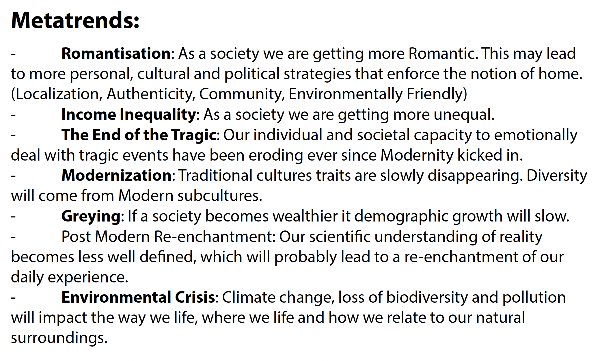
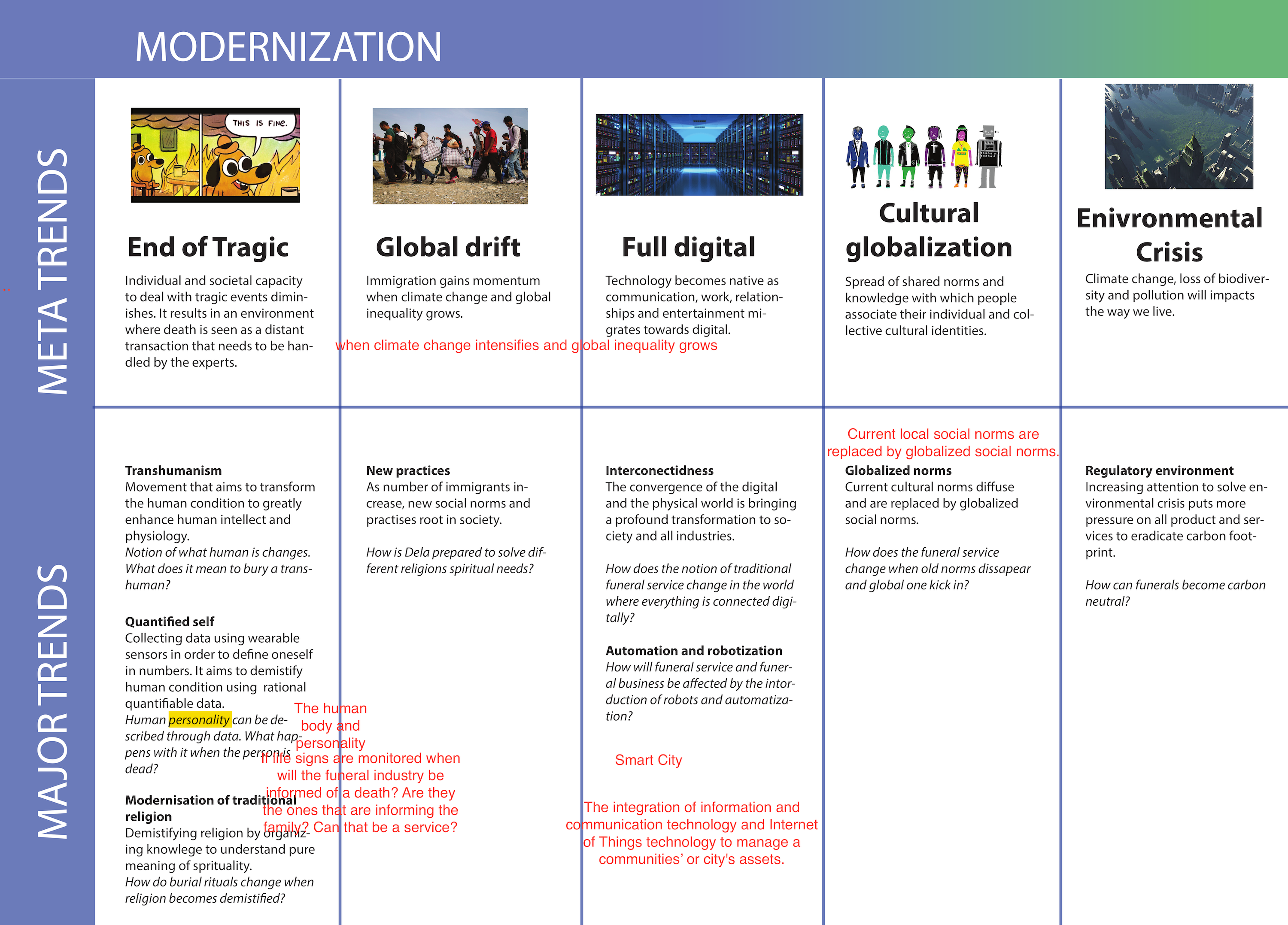
Then, I structured all the information into a table. Although this approach provided a good structure for different types of content, it was too rigid (and boring) to explore.
While looking for more organic way to show information, I came across a multiverse diagram which represents multiple timelines.
This information design allows to create simple exploration paths and structure information well at the same time.
With Monnik we mapped out all future scenarios and trends connections accurately.
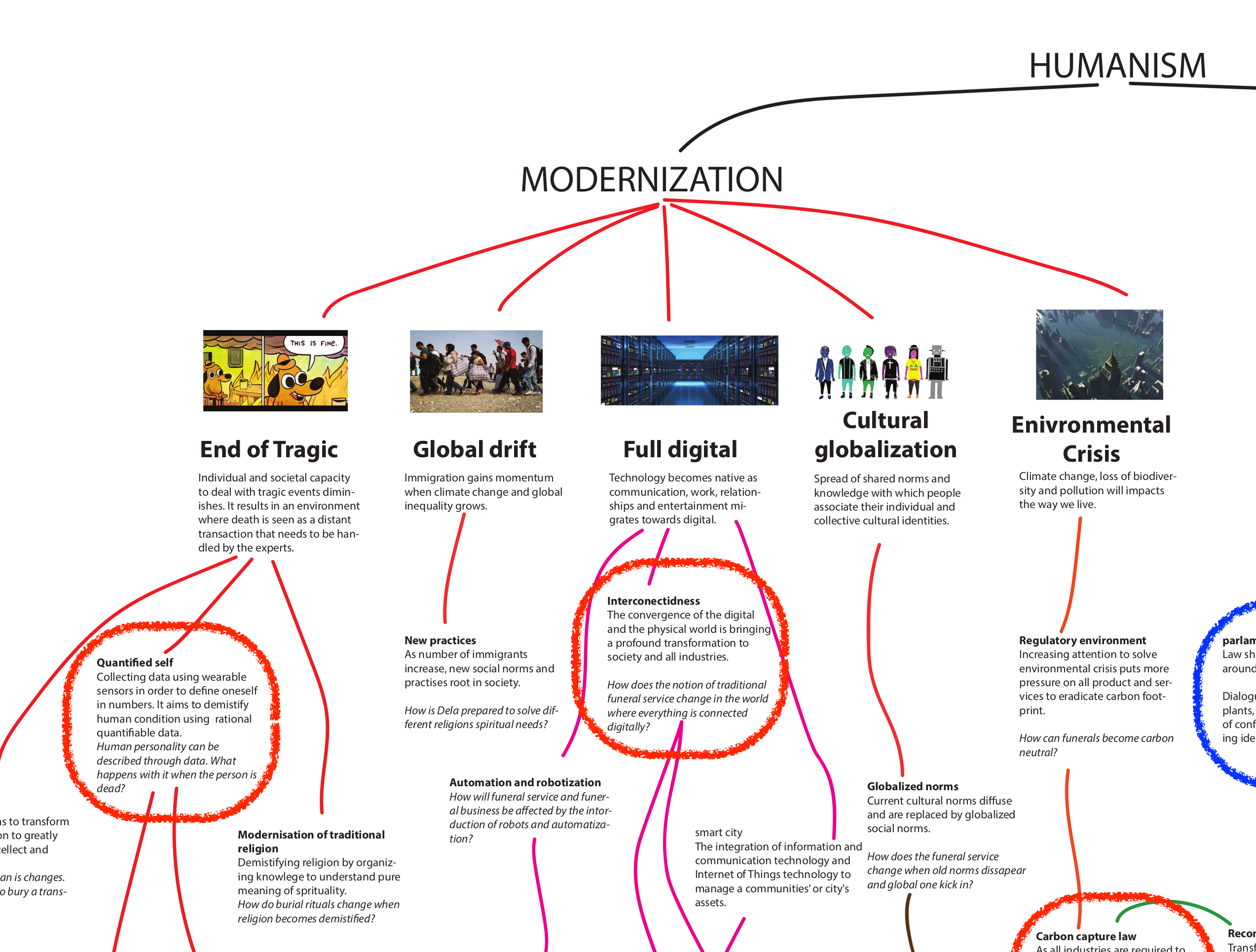
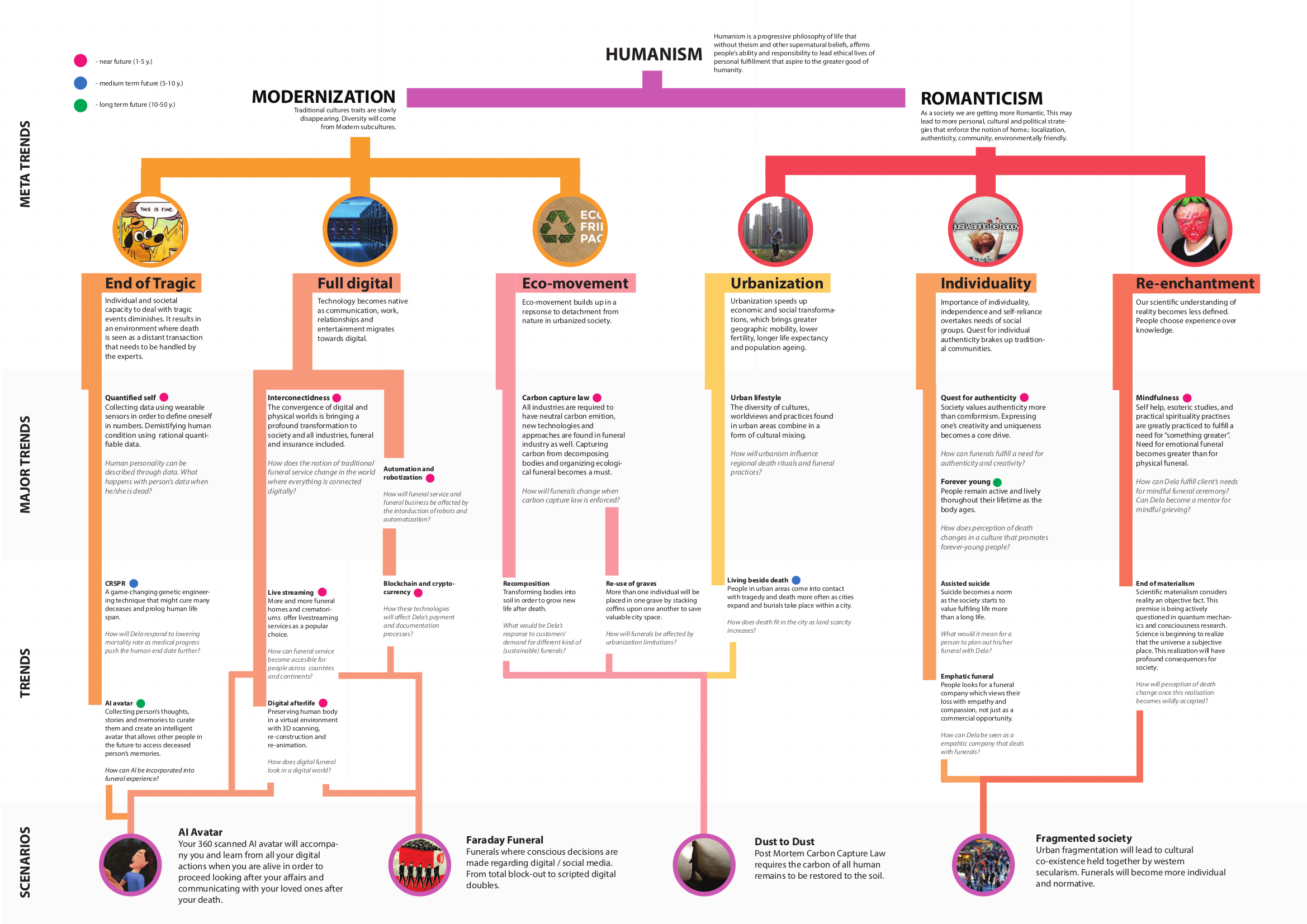
The last challenge was to find balance between structure and playful exploration. To achieve this balance I used different line weights (provide information hierarchy), colors (indicate exploration paths) and horizontal sections (signify categories).
All together, these visual cues help viewers to understand high level story and nudge them to explore their future(s) in depth.
With Monnik we mapped out all future scenarios and trends connections accurately.
When making design decisions, it was important to think from the client’s perspective. By understanding what goals should this visual accomplish, I was able to find a good balance between information overload and oversimplified design.
During a project pitch, this infographic was a central discussion point - it showcased amazing Monnik’s future scenarios work in a way that created excitement for the client.
