Problem
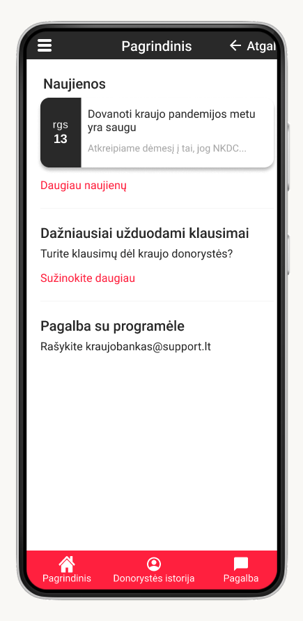
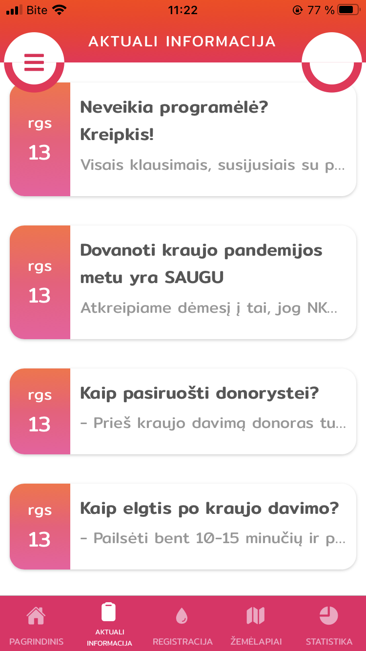
1. Information and features were divided based on the type of content, but not its usability.
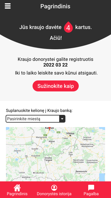
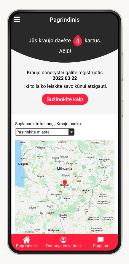
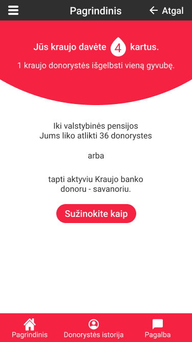
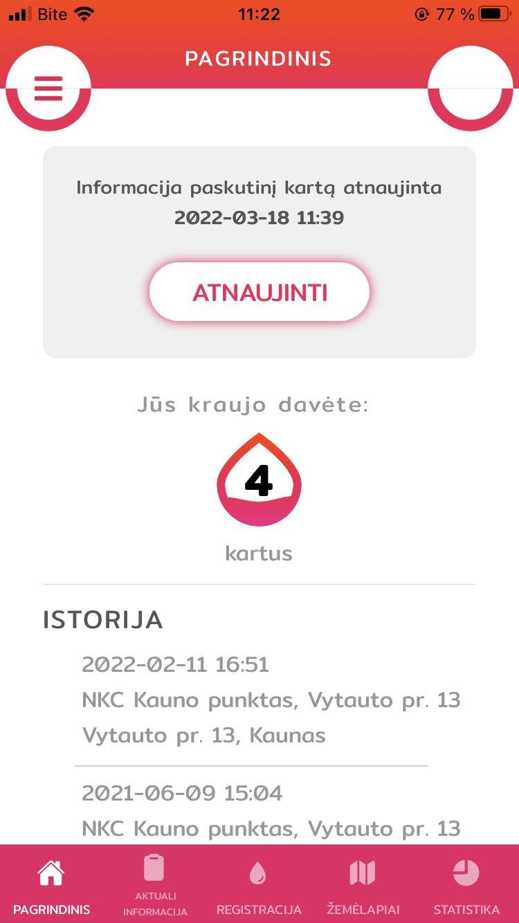
2. In home screen the main CTA was reserved for a trivial task - to update information manually.
3. Information and features were divided based on the type of content, but not its usability.
Solution
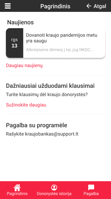
1. Grouping information and features based on use cases.
2. I replaced it with a CTA that is the core of this app - to register for a blood donation if possible or to get ready for one.
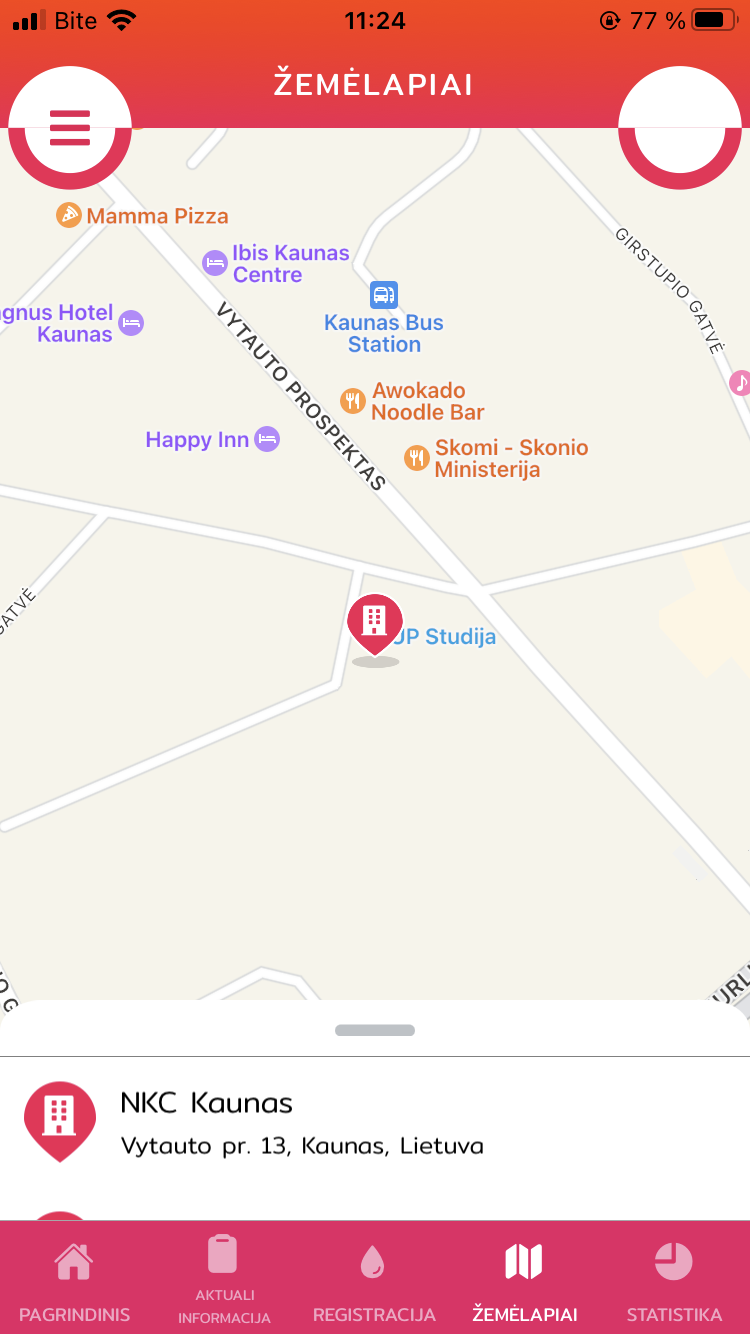
3. I added more actionable information - blood bank location and work hours.